In a surprise move at the end of August, CARRERA is offering a facelift for its website.
Faced with this kind of change, we’re often torn. There’s the frustration of losing our familiarity and feeling disoriented, especially after using the old version for years. But there’s also the satisfaction of discovering improvements that optimize navigation and make it easier to access information.
As is often the case when something goes online, not everything is perfect. Particularly with the French translations, which are sometimes missing or poorly translated, but this will improve over time.
With each change to the site, I hope not for a makeover, but for new sections and features. Do we have new reasons to visit the CARRERA website?
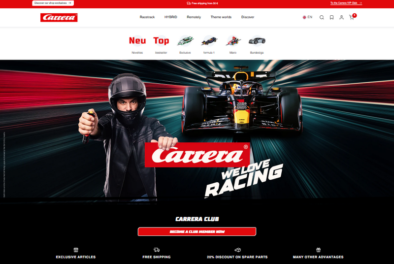
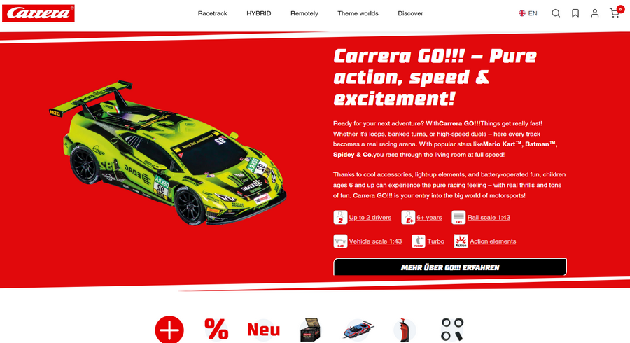
The home page and menu
The homepage has been streamlined and is less cluttered. The simple top menu groups the main categories (Slot, Hybrid, RC and the rest) with a submenu that appears and is as simple as it is effective. It displays photos of the main subcategories and below, sections on the selected theme.
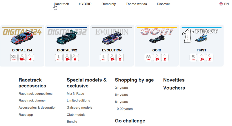
The Road Circuit Menu
The ranges are well presented with their logos, a nice photo and icons on key parameters like size with scale, age and number of players. Simple and effective. The lower part targets pages that group articles by theme.
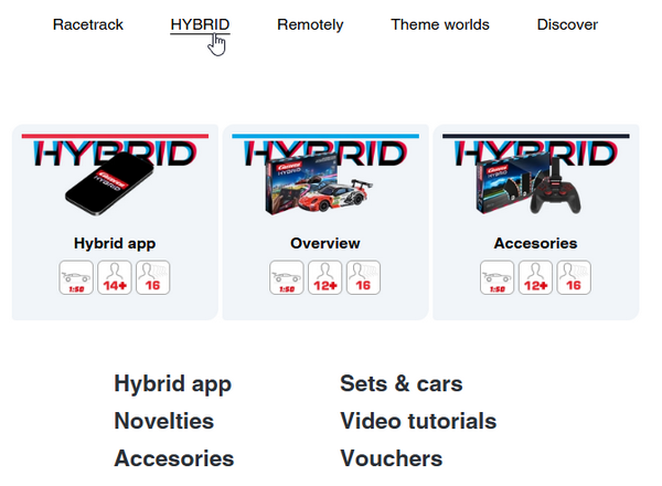
HYBRID
While the previous version of the site had only one page on the Hybrid, this section has expanded to include several pages. This makes it easier to view the range, which has expanded this year.
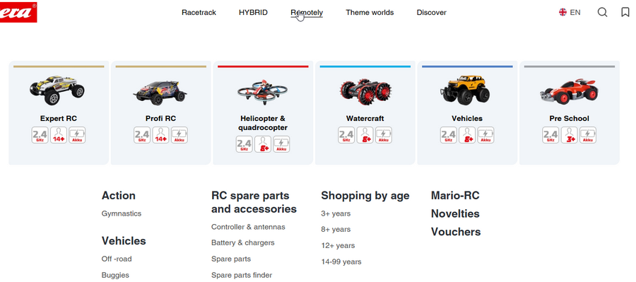
Radio Control
On the RC side, the menu is divided into 6 ranges, which allows you to clearly understand the offer.
The product families page
When you arrive at a major category, you arrive at a page that quickly presents the range. No blah blah, just useful information.
And below, a grid presents the articles. A simple grid of tiles that can be filtered according to different parameters.
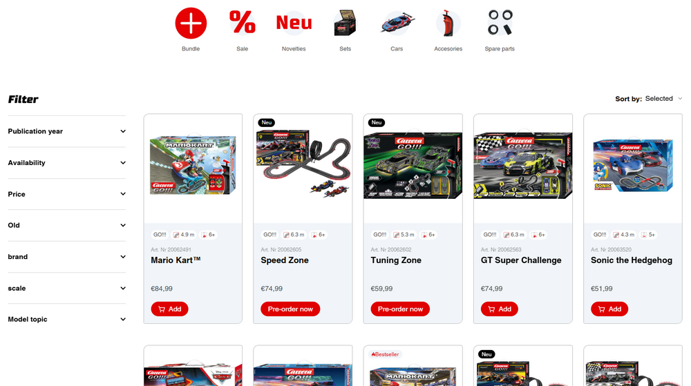
I really like the image change when hovering over the box photo. It quickly gives another view of the product without necessarily opening the page.
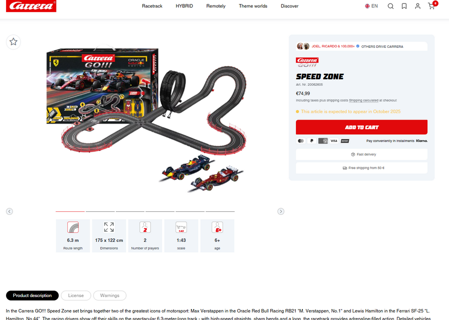
A product page
The new design is simple, with new icons for product features.
The section that displayed all the components of a circuit to identify the turns and cars is missing. It’s sad that this useful feature is disappearing.
I also regret the fact that thumbnails of all the available photos aren’t visible. This is useful when you want to access a specific view, a car, or just the circuit. Now you have to scroll through the entire process until you reach the desired photo or choose randomly.
New and lost features
Well, after looking around, unfortunately, there are no new features on the CARRERA website. I dream of new sections for us fans and turning off our interactivity. Well, CARRERA hasn’t done that.
Useful features have disappeared. No new sections. A site built purely for marketing design, not to make the visitor’s life easier. But I still hope that one day something useful will arrive.
Furthermore, I’ve always had trouble understanding whether this is a sales site or an information site. I’m waiting for an information site to find all the brand’s models. Not only current references but also previous ones. We all have an old product at home, and we’re always happy to find it again, but also to find its documentation. Well, that aspect is missing. We only find the models sold by Carrera. It’s sales that take priority, and that’s a shame. Especially since 90% of drivers will buy their model from a dealer and not on the CARRERA website.
Where are the files listing vehicle spare parts?
The section for finding product documentation has also disappeared. It wasn’t very up-to-date. Another loss of a useful section.
We’ll see in the coming days and weeks whether the teething problems of this new CARRERA website are corrected. Some aspects took months, even years, to be corrected in the latest version. Not long ago I was saying to myself that the CARRERA site was finally clean and no luck, we’re starting from scratch.
All this can be seen here:
https://carrera-toys.com/